Move fast, don’t break trust
Read about the design decisions behind the PhonePe app redesign.
September 10, 2025

Earlier in 2025, we shipped a redesign of the PhonePe app. It came from a clear shift in our business direction: from a digital payments platform to an ecosystem of financial and utility services built for everyday use. The design team played an important role in translating the business’ ambition into a faster, sleeker product that did more, but stayed just as trustworthy.
Redesigning an app used by 61 crore+ people across 34+ crore daily average transactions* meant every design decision would impact numerous financial interactions simultaneously. On top of that, our users range from first-time digital payment adopters to power users managing complex financial portfolios through our platform.
Designing for this spectrum meant every pattern had to work across vastly different comfort levels with technology. We had to respect objective metrics, but also embedded routines, subconscious gestures, and deeply anchored expectations. We had to achieve this all while maintaining the trust that took years to build in a domain where reliability is essential. The redesign had to feel, above all, like a continuation of what the user already believes about the brand and how reliable it is.
With over 200 designers and engineers collaborating over more than 800 screens, we reimagined the app’s information architecture (IA), rebalanced the interface, updated the visual language, and introduced entirely new features. Now that we’re on the other side of the redesign, here’s a reflection on a few creatively challenging problems the design team had to solve.
Balancing familiarity and freshness
Familiarity leads to confidence. The more familiar a user becomes with an app, the more its interface translates into a sense of control. This predictability works both ways: even suboptimal flows, when repeated enough, start to feel “natural.” Users often become more afraid of losing familiarity than excited by the prospect of something sleeker or smarter.
The flip side is that familiarity might also keep users tied to older flows, extra steps, or complicated layouts. But given that a different label or switched-up button could trigger discomfort (“Did I just send ₹5,000 to the wrong person?”), preserving users’ sense of agency was non-negotiable. And since many of our users learn by trial, habit or with help, even minor visual or structural changes can trigger cognitive dissonance and drop-offs.
So we asked ourselves:
What do users expect when they open the app?
What actions are they primed to take based on muscle memory and frequency of need?
This helped us define what to redesign intentionally.
Balance in action: redesigning the homepage
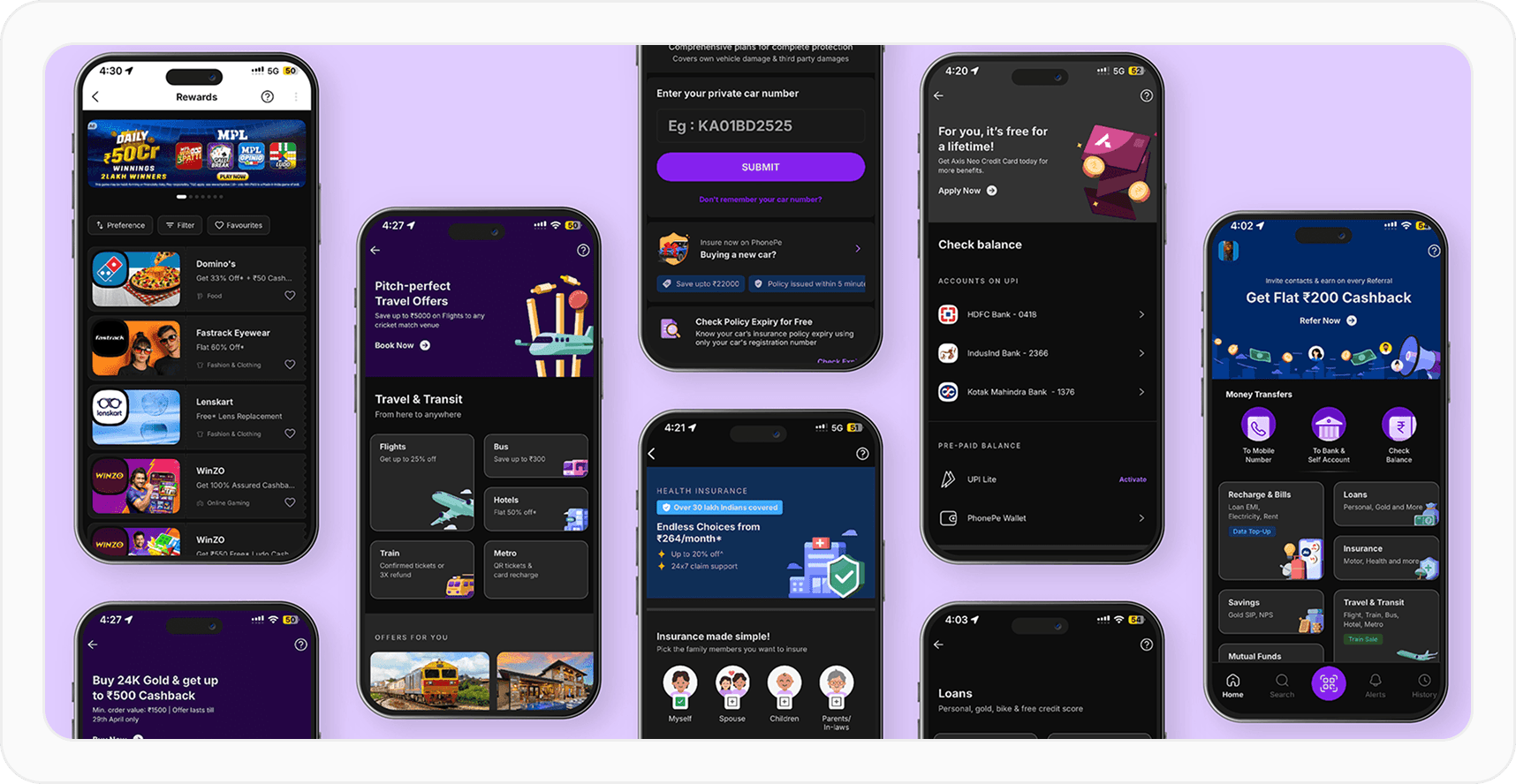
When we were redesigning the homepage, we wanted to make sure other financial services were visible and naturally more discoverable. This also followed on from users’ feedback. So, we changed the IA of the homepage from icon-heavy grids to more contextual and clearly grouped layouts.
This approach gave users a clearer snapshot of essential information and PhonePe’s range in one quick glance. It made finding relevant services—especially newer payment methods like RuPay Credit card and UPI Circle—more intuitive.
On the other hand, we kept the most common user actions—sending money to a contact, transferring to your own or another bank account, and checking your balance—exactly where they’ve always been, at the top of the home screen. One, it made business sense. Two, it retained the familiarity that came with users frequently reaching for these categories on a daily basis.
A second major change was the placement of the QR code scanner. In the older design, the entry point was at the top of the screen and a lot smaller. We understood that people using the scan QR were probably in a state of urgency where the quickness of the action mattered: paying a taxi driver, for example, or at a grocery store.
So we moved the scanner entry point to the footer. We made it bigger and easier to find and use. We also ensured the scanner was within the “thumb zone”: the range of reachability for a user’s thumb while they’re interacting with their phone with one hand. Many users found it to be so useful, they added the scanner as a widget to their home screens, too!
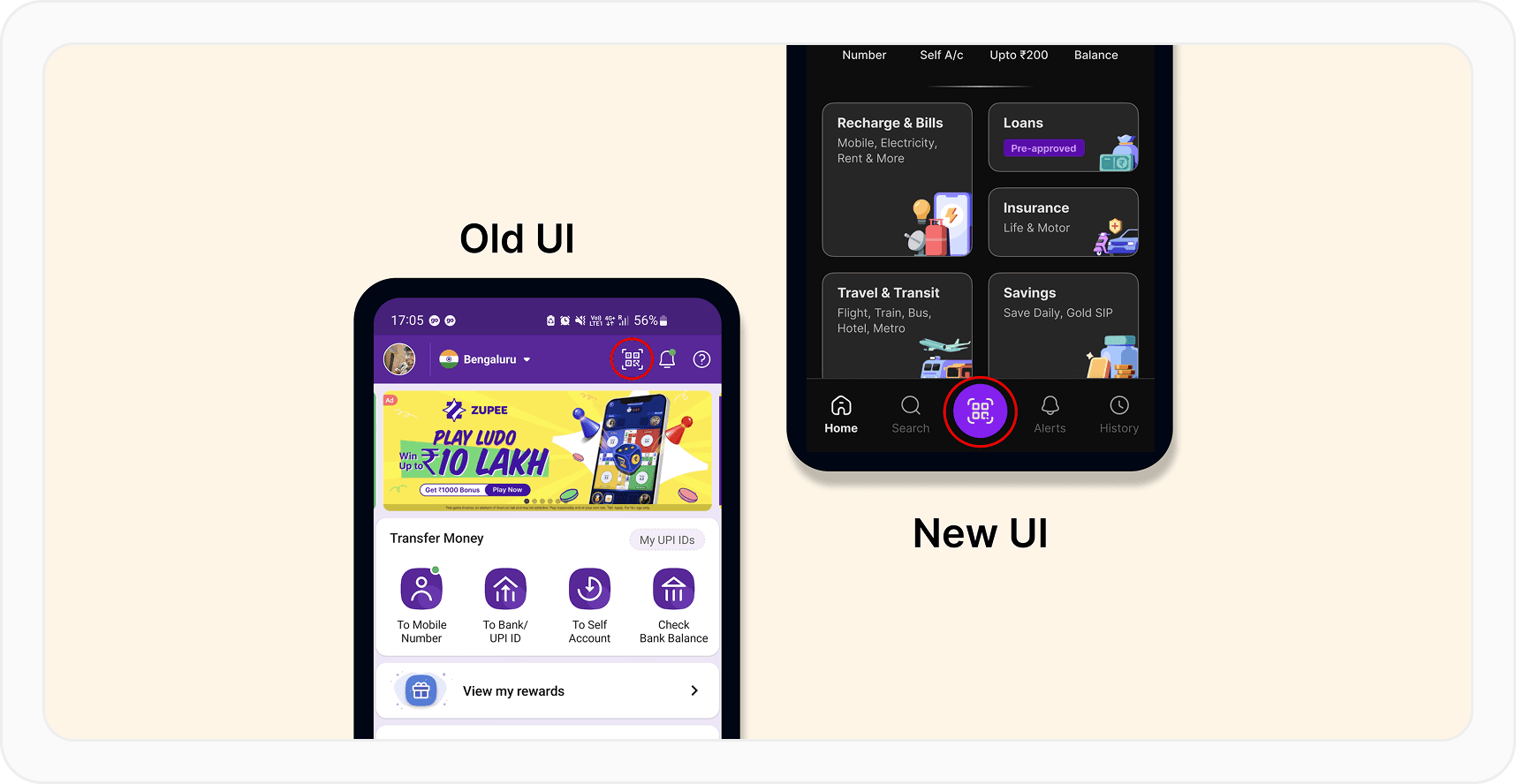
The homepage’s new design also reflected the organisational improvement that was made beyond the homepage. The Mutual Funds category, for example, is similarly organised into groups based on investment types. Across categories, each sub- category was given enough visual breathing room and supporting illustrations so that the most relevant option is always immediately visible to the user.
Responding to behavioural anchors
In the ideal world, every user loves a redesign. In reality, people need time to unlearn and relearn, especially after spending years with a previous interface. Psychology calls this procedural memory: the type of long-term memory related to how we do things, often unconsciously. Our users already had behavioural anchors—like tapping without reading or subconsciously associating icons with actions—so even objectively better flows could feel worse if they break those anchors.
To tackle that, we designed transitional scaffolding. For example, our first release note after the redesign said: “A modern new look and powerful new features, but still the app you trust”. We repeated that sentiment in the onboarding animation that showed up for existing and new users.
The new onboarding, featured on 60fps
Within the app, we used interstitials, subtle nudges, and landing pages for new features to help users build new habits without feeling lost.
Enabling business growth from payments to financial journeys
As our financial services ecosystem matured, it was apparent that many users strongly associated PhonePe with being a payments platform, and operated in “get it done” mode.
The business teams saw an opportunity to broaden how users perceived what PhonePe could help them do. They were already using the platform to send money; we now wanted them to see us also as a platform to spend, manage and grow their wealth.
The design function was instrumental in strengthening that long-term value to users and building a more robust and sustainable business.
We worked with almost every other function in the company to position PhonePe’s financial services as a natural next step in the life of someone who just paid their child’s school fees, split expenses with their friends, or simply checked their balance.
Our goal wasn’t to push every service to every user, but to make the relevant ones more visible, discoverable, and meaningful. Everyday actions would begin to feel less like isolated payments and more like strong steps in financial growth.
In conclusion
At our scale, a redesign is a balancing act between preserving habits and enabling change. When you design for millions of people like we do, the North Star is always to build something that continues to work, effectively and reliably. We’re proud of what we shipped, and excited for what we design next!
*All data as of March 31, 2025


