Creating DS documentation that empowers
The story of how we built the documentation hub for Mint DS
October 17, 2025

Design systems are powerful tools for scaling design quality and efficiency, especially when designing for 61+ crore registered users*. When they work well, teams move faster, maintain consistency, and focus their creative energy on solving new problems instead of reinventing solutions.
But we’ve also learnt that a design system is only as good as its documentation.
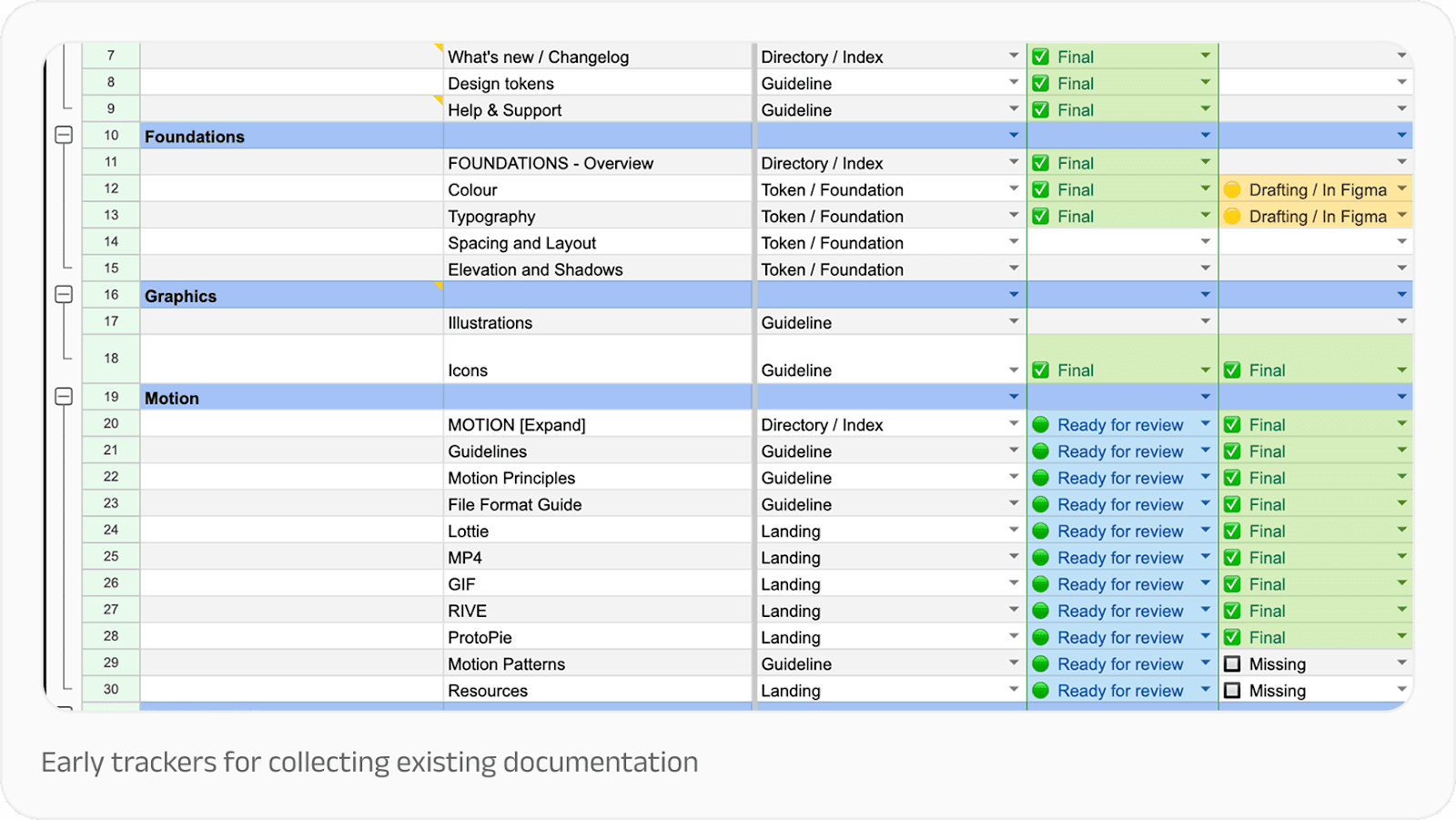
Challenge: Collecting scattered pieces
Our design system had just gone through a major refresh. For months, our tightly-knit design system team had been focused on rebuilding the foundation from scratch. But as the core system stabilised, our focus could finally shift toward scalable practices.
When we began documenting our design system, Mint, our challenge was two-fold.
First, we needed to get everything in one place. We had all the information we could possibly need, but they were scattered across Google Docs, Figma files, and email threads. While this is a standard design debt for scaling companies, it was something we wanted to rethink entirely.
We needed to move from tribal knowledge to shared understanding, creating a single source of truth that designers, developers, and writers could all align on. Our goal went beyond creating a knowledge repository, to building a tool for governance, learning, and collaboration. We needed a solution that didn’t need a dedicated content team. It had to be lean, practical, and maintainable, so that existing teams could sustain it without adding specialised resources.
Second, we needed to make the documentation the path of least resistance for anyone building products with our system. Teams had to see documentation not as bureaucratic overhead, but as essential to the impact of their work.
After all, design systems are fundamentally about empowerment: giving people tools and information to improve upon what has already been built. They should establish a floor of quality that everyone can build from, not a ceiling that limits possibility.
We also knew our documentation would double up as our design system’s primary ambassador over time. As design system expert Dan Mall observed: “Any design system that needs to do some amount of evangelising—i.e. all of them—should have a bit of sales pitch in them.”
Approach: Building with intention
Before diving into content creation, we established clear principles to guide our work. This went a long way in helping us make decisions when resources were tight and the backlog was long.
Start small, scale later
We focused first on getting a working MVP rather than a comprehensive encyclopedia. A lean page that helped someone solve a problem was infinitely more valuable than a perfectly polished page that didn’t exist yet.
Less theory, more practical
We concentrated on content that was actionable and that people actually cared about. Design philosophy and nice-to-haves had their place, but not at the expense of helping someone ship their feature on time.
Focus on how and why, not just what
Our components already existed in Figma with detailed specifications. What people needed was help using them effectively. That meant: understanding not just what a component was, but when to use it, why it mattered, and how to adapt it to their specific context.
Curate before we create
Rather than starting from scratch, we committed to reusing and rewriting existing material. Someone had already written that explanation, created that flow, or documented that decision. Our job was to find it, refine it, and give it a proper home. This would go a long way in ensuring consistency and reduce confusion across a 70-member design team.
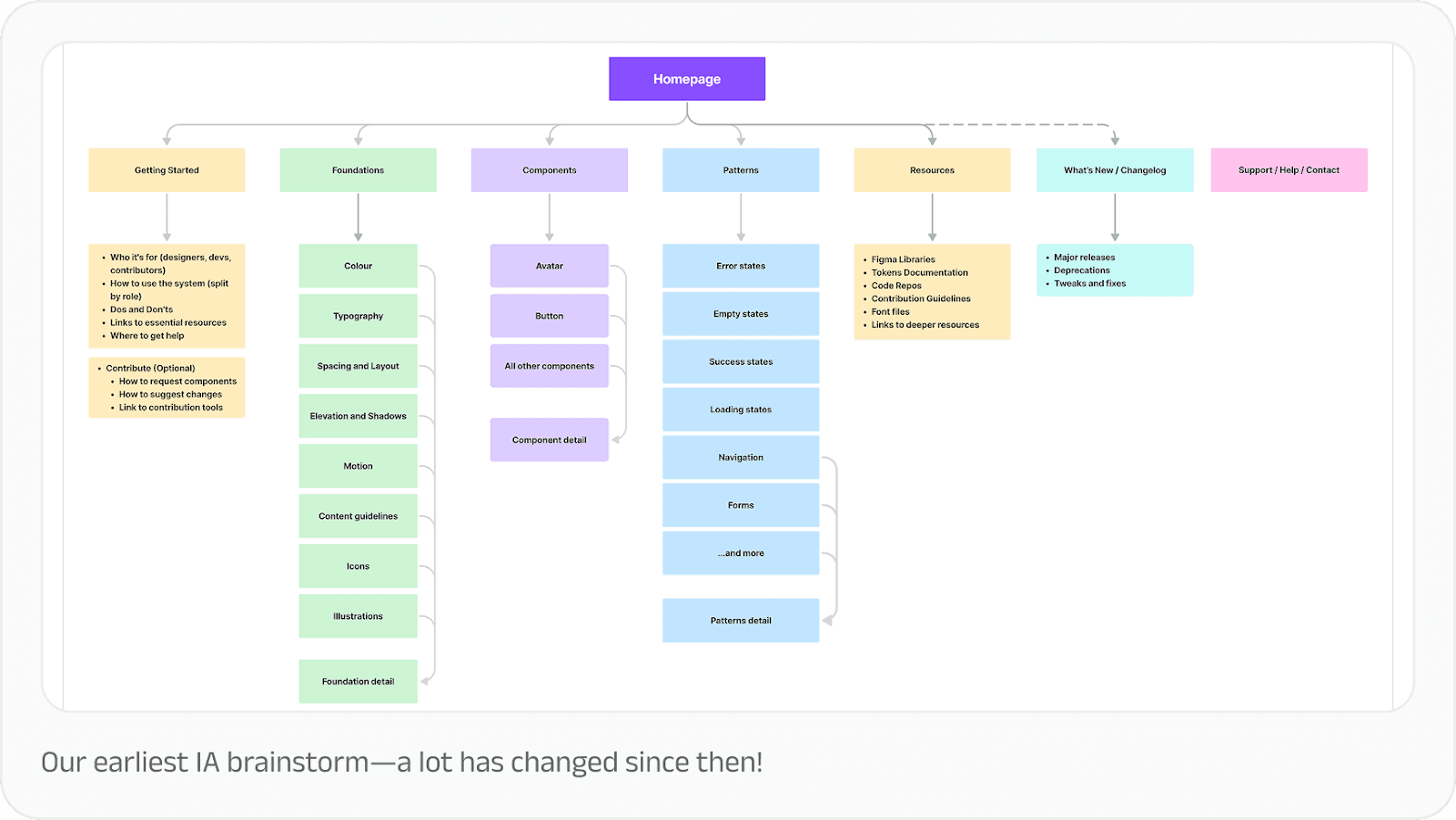
Design for scalability from the start
Even though we were starting small, we needed a structure that could grow as our products and design needs grew. And so, every decision about information architecture, navigation, and content templates was made with future expansion in mind.
Make it useful first, beautiful second
As designers, our instinct is to polish. But for this to work from the get-go, we wanted to validate the utility first, before perfecting the aesthetics. We were also aware that when people would begin using the documentation immediately, their use would validate the need for it, and buy us more time and resources to get better versions out consistently.
Collaborating with subject matter experts
One of our most important strategic decisions was recognising that the design system team couldn’t—and shouldn’t—do this alone. For this documentation to work, it needed to be a cross-functional effort, and that meant partnership with different disciplines.
The design system team led structure and strategy. Our UX writers shaped the copy, voice and tone guidelines. Motion designers, illustrators, brand designers contributed to their respective topic areas. Developers helped validate critical implementation details. During reviews and show and tells, the broader design team shared their inputs that helped us make this more usable.
We treated the documentation project like we would a product feature. That meant asking product thinking questions: How will users arrive at this information? What path will they take? How might they stray from that path, and if they do, how do we enable them to course-correct and find what they need?
We mapped user journeys through our documentation the same way we’d map journeys through our products. We identified entry points, decision points, and potential dead ends. We designed navigation and wayfinding with intention. We created breadcrumbs, related links, and search functionality that actually worked.
What we learnt
Documentation is a living system. The moment you think you’re “done” with documentation is the moment it starts stagnating. Systems evolve, products change, teams learn new things. Documentation must evolve in lockstep.
Good structure is half the job done. Your documentation is only as good as people’s ability to find what they’re looking for. We invested heavily in information architecture: how content was organised, categorised, and connected. That investment has already begun paying dividends, as people are able to find answers and guidelines faster in Mint Docs than any previous documentation we’ve had.
We also learnt that it’s important to make documentation part of the design process, not a side task. We recommend including documentation in your Definition of Done so that it’s always given its due time and completed with quality.
And finally, it really helps to get feedback early and show people what you’re building. Early sharing built excitement and surfaced issues we wouldn’t have caught otherwise. Someone would say, “I was looking for a list component the other day and couldn’t find it,” and we’d realise we needed a different entry point or a better search term. These small course corrections added up to much more usable documentation for the team.
Good documentation is an enabler
In our experience, the Final Boss of design system documentation isn’t just gathering information, it’s presenting in a way that’s navigable and usable in the spur of the moment.
That’s what great design system documentation does: transforms a collection of design assets into an interlinked, shared language for building products.
Thanks to Subhankar Das and Kanishk Rawat from the Design Systems team for the inputs that shaped this article.
*All data as of March 31, 2025


