What does Design mean at scale?
Building something that's seamless on the surface and dependable underneath.
August 10, 2025

What’s special about the round purple button on the PhonePe app? We’ll tell you.
In June 2025 alone, India processed over 1839 crore UPI transactions, and PhonePe contributed significantly to that volume. The QR feature—which looks like simple interface design—sits at the centre of countless everyday actions: paying a fruit seller, settling restaurant bills, transferring money between friends. It works reliably across network connection levels, low-end devices, diverse merchant setups and other scenarios that occur in real life.
Building something that seamless on the surface and that dependable underneath is exactly what makes design critical at scale.
Scale is a magnifying glass
When your products serve over 61 crore registered users*, design stops being about polish or preference and becomes about structure, coordination, and resilience.
Every design decision is tested numerous times a minute, giving us rapid feedback on what works and what must evolve. We're designing for millions of variations and learning from how people move through them.
Consider something as fundamental as how the app handles interrupted transactions. A user starts making a payment, gets a phone call mid-flow, answers it, then returns to the app. When thousands of people use your products at the same time while living their actual lives like this, every state transition becomes critical. The system needs to know: Was the payment initiated? Should it time out? Can the user safely retry?
This is design work that happens in close collaboration with other functions, is almost invisible to users, and shows up almost exclusively at scale.
Scale introduces non-negotiable operating principles
PhonePe’s products operate in regulated domains like finance, insurance, and e-commerce. They come with baseline requirements from day one, like KYC norms, SEBI regulations, and GST compliance.
But scale adds new layers: handling traffic spikes, syncing with backend systems, and absorbing delays or mismatches without breaking the user experience. It has to account for negative scenarios—payment partner delays, double taps, sudden network lags—and correct for them gracefully. Even something as basic as two friends using different app versions needs to be handled without breaking the experience for either.
These infrastructure-level concerns directly shape what users see and do. The role of design is to absorb this complexity and prevent it from leaking into the user experience. At scale, design defines how reliability is experienced.
Case in point: FASTag purchase
When a user tries to buy a FASTag on PhonePe, the systems behind the seemingly straightforward flow are complex. It involves validating a user’s vehicle details against external databases managed by issuing banks, under protocols defined by NPCI and NHAI. Vehicle numbers must follow a fixed format. Not all banks support partial lookups. Each entry triggers backend checks to determine if a tag can be issued, recharged, or rejected.
Design had to account for success and failure across several scenarios, such as:
when the user enters an invalid combination of vehicle type and issuer
when the vehicle is already tagged by another bank
if the issuer’s system is down but doesn't return a clear error
if the tag is suspended, even though the vehicle number is correct
Design has to work with the system’s logic, surface the right level of detail, and create clear paths forward. It has to define not just how success looks, but how failure behaves: from what can be retried to what error message and illustration the user sees. At scale, a product is only usable if it’s designed to function through uncertainty, not just around it.
Scale brings diverse and non-linear users
The user bases of the PhonePe group’s products are beautifully complex, and diversity operates across multiple intersecting dimensions.
For example, one user might be fluent in UPI, unfamiliar with investing, and somewhere in-between when ordering groceries online. Another might live in a Tier 1 city and use a mid-range phone shared with family.
Language adds another layer: the same person might prefer English for everyday transactions and Tamil when helping elderly relatives navigate the app. They enter flows from different places, with wildly different expectations and digital literacy levels, and don’t always move in a straight line from start to finish.
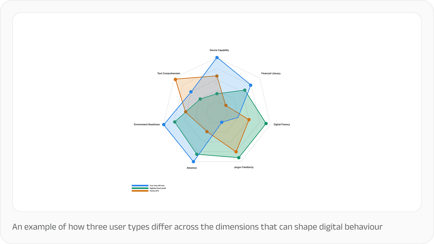
How three real user types differ across the dimensions that typically shape digital behaviour
Instead of flattening this complexity, design actively supports this user base that mirrors India itself: multilingual, multi-generational, and economically diverse. We account for this complexity in both interface and infrastructure:
Legibility across languages
We work closely with language localisation and QA teams to ensure the copy and layouts are translatable into over 10 Indian languages including Hindi, Tamil, Kannada, Telugu, Gujarati, and Assamese.
Far from a one-time translation effort, this expectation is seeded right from the initial wireframes. From the earliest wireframes to final QA, we structure flows and copy for clarity first, ensuring that the same message lands with equal ease across 10+ Indian languages.
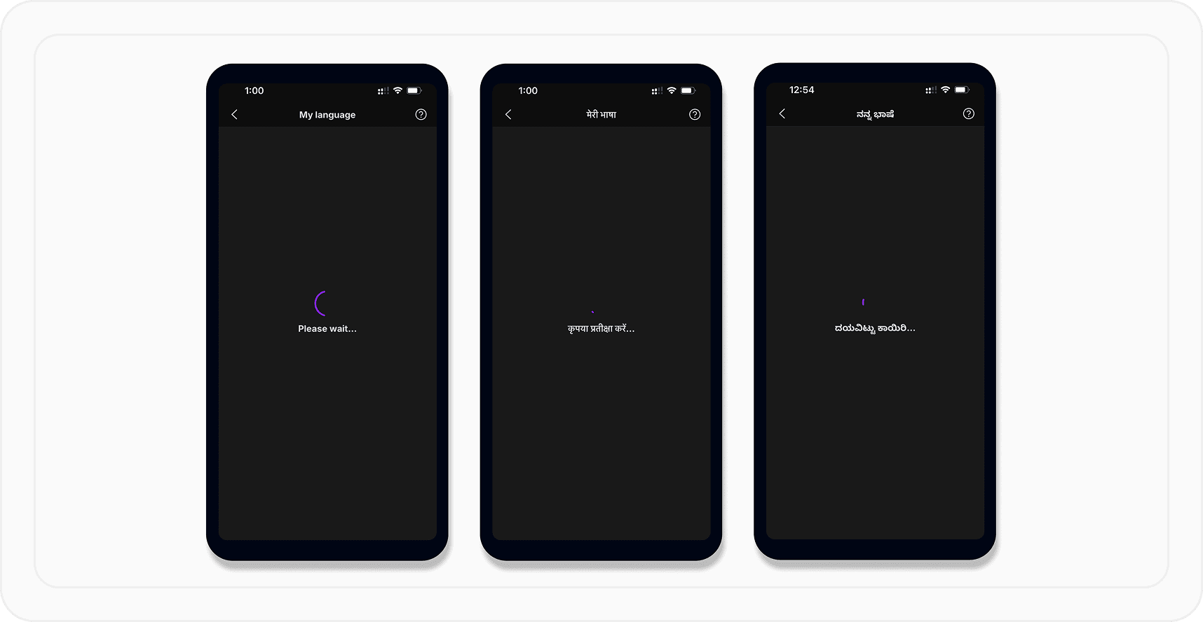
For instance, we’ll often go with “Please wait” on a PhonePe loading screen instead of something more casual like “Hang on” or “Hold on a minute.” While the latter may feel more expressive in English, they don’t translate cleanly across languages. They could feel abrupt, overly formal, or simply unclear.
“Please wait,” on the other hand, translates across languages, like “कृपया प्रतीक्षा करें” in Hindi and “ದಯವಿಟ್ಟು ಕಾಯಿರಿ” in Kannada. Both of these options are clear, respectful, and unambiguous.
Predictability
Users rely on muscle memory for frequent actions. We keep button placements, interaction patterns, and state changes consistent across flows to reduce relearning and errors.
The Pincode Seller platform, for example, indexes heavily on predictability. Store staff and picker-packers, often working in noisy, crowded shops with varying levels of digital comfort, need systems they can learn once and repeat easily. Core flows follow fixed structures and predictable steps so users know what to expect each time they perform that task, regardless of who’s performing it.
This sort of consistency makes our products easier to use and more resilient to real-world interruptions. Even with mid-task interruptions or shared devices, users know what to expect when they return.
Iconography
Many users scan interfaces rather than read every word, especially in busy or distracting environments. So we treat icons as part of the product’s shared language: repeating the same symbol across features, avoiding abstract metaphors, and testing for cultural resonance where needed. A good icon is one that carries meaning, supports comprehension, and holds up across different literacy levels and screen sizes.
Icons also need to match the mental models people already bring with them. Many users come into a product with assumptions about what a symbol means. Symbols turn into shorthand, like a compass for discovery, a bell for notifications, or a question mark for help.
Understanding and applying existing visual cues that are already familiar can reduce ambiguity, speed up recognition, and help the interface feel instantly navigable. Consistency within the product matters, but so does consistency with the world outside it!
Design aligns the work of many
Design leadership works on two levels at once. On the outside, it makes sure users get a coherent experience despite all the complexity behind the scenes. On the inside, it keeps teams from being pulled in completely different directions and leading to a fragmented experience.
At scale, every product surface is shaped by multiple teams: Business, product management, engineering, legal, compliance, marketing, and support. Each of these bring valid and experiential insights about how to make the product successful.
After all, being the voice of the user is only half the story. Beautiful, user-centric flows should also solve for business objectives, like driving adoption and achieving scale, while balancing compliance and other regulatory complexity. Design that works with ground realities will almost always be successful.
At PhonePe, design acts as both translator and force multiplier: helping teams speak the same language while balancing both user needs and business objectives.
***
At scale, design shifts from craft to core operational system. As much as that shapes our products, it also shapes the meaning and practice of design itself. It pushes us to think structurally, act precisely, and use complexity as creative scaffolding. It shows us that design today is more layered, demanding, and meaningful than ever.
*All data as of March 31, 2025


