The language of data: Designing for storytelling and action
Making sure our data visualisations are not just accurate, but resonant
April 7, 2026

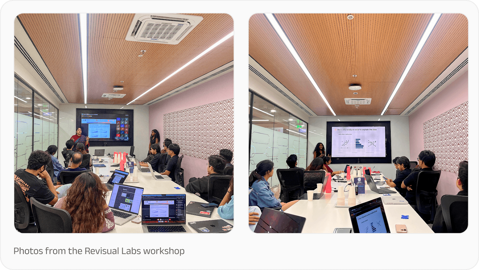
Earlier this year, the PhonePe Design team sat down for a data visualisation training session with Revisual Labs, a renowned design and data visualisation agency. The goal was to enhance how we communicate complex financial data as compelling, human-centric stories.
As one of India’s leading fintech platforms, we handle a staggering volume of information, managing a base of 65+ crore registered users (as of September 2025). Turning these massive numbers into clear, actionable insights requires more than just a spreadsheet; it requires a specialised design philosophy.
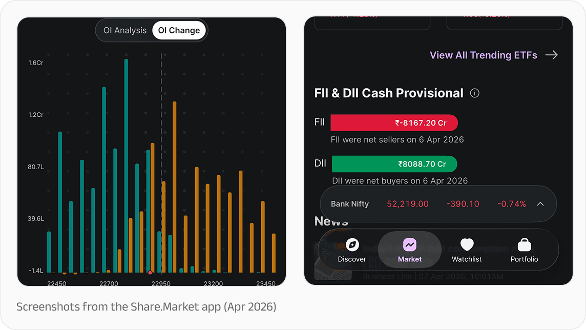
While high-level reporting is vital, the way we present data directly to our users is equally important. We see this every day while designing for Share.Market, for example, where real-time market indices and analysis tools must be clear and actionable at a glance. We want to always make sure our data visualisations are not just accurate, but resonant.
Purpose and audience
Every great visualisation begins with a clear "why". It happens across a functional spectrum: Exploring to find new stories, Examining to monitor performance via dashboards, and Explaining to guide an audience toward a specific conclusion.
However, the "why" is inseparable from the "who". Our audience ranges from strategic partners who need to see the arc of our journey, to product users who value clear and immediately understandable infographics that make decision-making easier. By aligning the purpose of a chart with the specific needs of the viewer, we ensure our message lands with precision.
The anatomy of a story-driven chart
A common pitfall in data design is the "data dump," where the viewer is overwhelmed by digits and precision. To solve this, every chart should be treated as a standalone narrative. This requires moving beyond generic labels to insight-driven headlines. Instead of a title like "Transaction Volume," use a descriptive headline such as "Peer-to-Peer Payments Dominate in [X] Cities".
Key anatomical elements include:
Titles: Must explicitly state the primary insight or story.
Annotations: Should live directly on the chart to provide context where the eye is already focused.
Axes: Should be muted and lighter than data points to serve as a reference without competing for attention.
The language of numbers and colour
Data visualisation is, at its core, a translation of numbers into visual "encodings" like length, position, and area. Designers should prioritise position along common scales because it allows for the most accurate human estimates.
And when communicating the numbers themselves, it’s always recommended to:
Use the rule of 8: Avoid using more than eight digits in a single paragraph to prevent cognitive overload.
Write in words: Use descriptive terms like "a third" instead of "33.3%" or "half" instead of "50%" to make data more approachable.
Make everyday comparisons: Relate abstract figures to relatable concepts. For example, describing a distance as "about the length of a cricket bat" makes the scale immediately tangible.
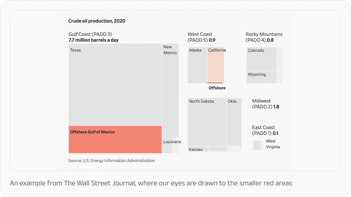
Colour, too, is a strategic tool rather than a decorative one. Grey, for example, is a powerful storytelling device. It de-emphasises the "noise" so that the "signal" i.e. the key data point stands out in a bold and purposeful colour as the Wall Street Journal demonstrates:
Accessibility: Design for everyone
The final, and perhaps most critical, pointer is ensuring that our charts are accessible to all. That means not relying solely on colour to convey meaning; instead, we can use symbols, patterns, and dashes to ensure clarity for those with colour vision deficiencies. Every visualisation should be backed by alt text that describes the chart type and its meaningful function. Put together, all of this can ensure data reaches every Indian, regardless of how they interact with our platforms.
These principles from the Revisual Labs data visualisation workshop serve as the North Star for PhonePe’s design team, helping us turn the "beat of progress" into a story everyone can follow. Thank you to the Revisual team for doing this!
Further reading
If you’re looking to dive deeper into effective data visualisation and storytelling, here are some resources that can help you:
Effective Data Storytelling by Brent Dykes: Explores the intersection of data, visuals, and narrative to drive change and enlightenment
Data Visualisation: A Handbook for Data Driven Design by Andy Kirk: A comprehensive guide that explores the four essential questions for making any chart: Is it trustworthy, accessible, elegant, and story-driven?
The Visual Display of Quantitative Information by Edward Tufte: A classic text on the statistical and design rigour required to communicate numbers effectively
WebAIM Contrast Checker: A vital tool for ensuring that text and graphical components meet WCAG (Web Content Accessibility Guidelines) AA and AAA standards for readability.
Color Inclusivity Guides by Sarah Fossheim: Resources dedicated to ensuring data is not explained through color alone, advocating for the use of symbols, patterns, and dashes for those with color vision deficiencies.
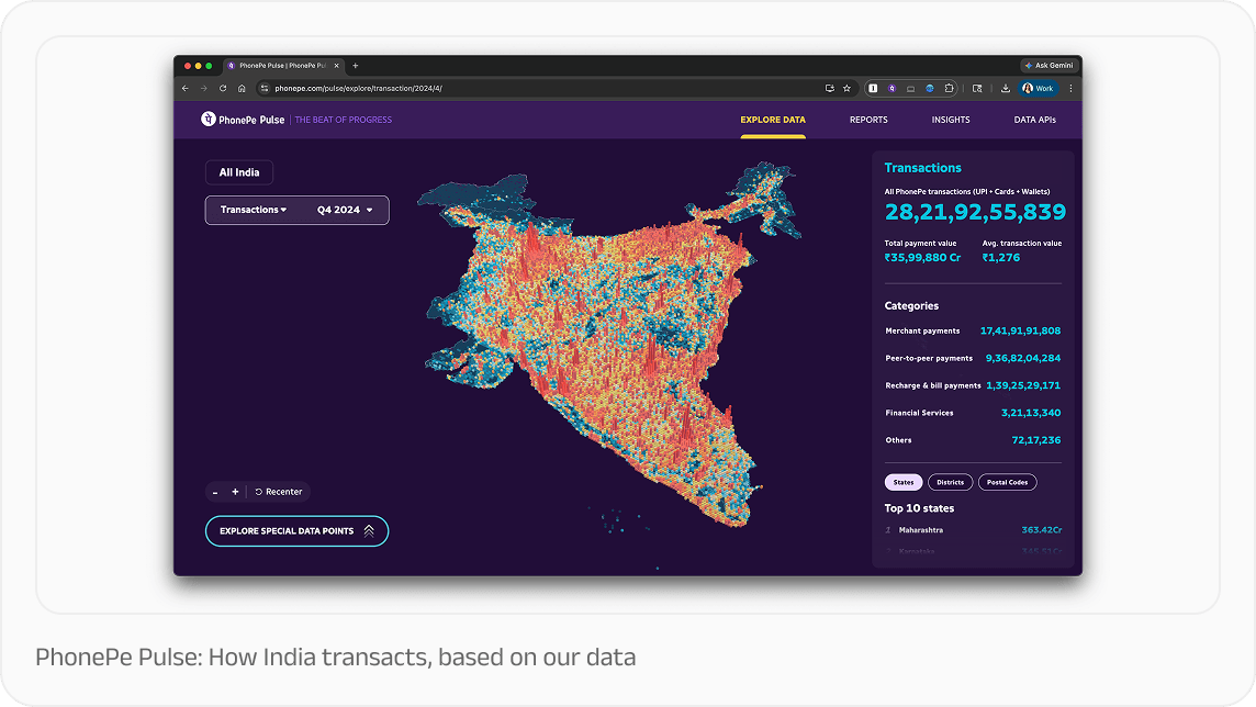
PhonePe Pulse: An interactive "Explore" tool that demonstrates how users can interact with data to uncover their own stories across different regions and categories.
Our World in Data: A benchmark for "Storyfinding" and "Storytelling" visualizations that track long-term global trends like child mortality.
The Global Findex Database (World Bank): A strong example of how to use simple, annotated charts to explain complex socio-economic data, such as gender-based access to banking.


